TOP
Blue Horizon
A non-profit organization with focus on transparency.
A non-profit organization with focus on transparency.
A non-profit organization with focus on transparency.
Research
Competitive analysis
User interviews
Empathy map
Wireframes
High-fidelity UI
Prototype
Usability study
Accessibility evaluation
Design thinking
Role
Role
Solo UX/UI designer on Google’s UX Certificate project
Solo UX/UI designer on Google’s UX Certificate project
Timeline
Timeline
June - August 2023
June - August 2023
Location
Location
International
International
OVERVIEW
OVERVIEW
Blue Horizon is a non-profit organization whose mission is to provide a good life for orcas and whales, focusing on rescuing and releasing orcas in captivity. In order to attract more donors, Blue Horizon needs a website that will provide potential donors with relevant info about the organization and allow them to donate money online for more convenience.
Blue Horizon is a non-profit organization whose mission is to provide a good life for orcas and whales, focusing on rescuing and releasing orcas in captivity. In order to attract more donors, Blue Horizon needs a website that will provide potential donors with relevant info about the organization and allow them to donate money online for more convenience.
PROBLEM
PROBLEM
Potential donors hesitate to contribute as most organizations websites lack clear information on how donations are utilized and the impact they make, creating a barrier to establishing trust.
Potential donors hesitate to contribute as most organizations websites lack clear information on how donations are utilized and the impact they make, creating a barrier to establishing trust.
THE GOAL
THE GOAL
Increase transparency on the organization’s website by providing clear information on how donations are used, ensuring potential donors have an understanding of the impact their contributions make.
Increase transparency on the organization’s website by providing clear information on how donations are used, ensuring potential donors have an understanding of the impact their contributions make.
Secondary research
Secondary research
Reports from Nielsen Norman Group’s research on non-profit and charity donation websites show that majority of problems were website content issues. Websites often failed to provide information people need in order to make donation decisions.
Reports from Nielsen Norman Group’s research on non-profit and charity donation websites show that majority of problems were website content issues. Websites often failed to provide information people need in order to make donation decisions.
“To encourage donations, focus on answering potential-donors’ top questions and streamlining the donation process.”
“To encourage donations, focus on answering potential-donors’ top questions and streamlining the donation process.”
User interviews
User interviews
After gaining some insight from secondary research, I decided to conduct a round of user interviews in order to better understand motivations of potential donors.
I interviewed 5 users who have donated money to non profit organizations at least couple of times in the last year.
I noticed a recurring theme in all participant’s answers, so I organized them in an aggregated empathy map:

insights
insights
Users are not sure what type of work organization does and how that work is done
Users are not sure what type of work organization does and how that work is done
Potential donors believe that there could be more transparency surrounding organizations
Potential donors believe that there could be more transparency surrounding organizations
Users have trouble trusting that organization is using donations appropriately
Users have trouble trusting that organization is using donations appropriately
They would like to know about impact of their donations
They would like to know about impact of their donations
competitive audit
competitive audit
Organizations didn’t provide funds allocation info in a way that is easy to understand for users.
Organizations didn’t provide funds allocation info in a way that is easy to understand for users.
While keeping above insights in mind, I analyzed 3 popular non-profit organization websites. These organizations did provide annual financial reports in PDF format which consisted of many pages of data that were time consuming to read through.
While keeping above insights in mind, I analyzed 3 popular non-profit organization websites. These organizations did provide annual financial reports in PDF format which consisted of many pages of data that were time consuming to read through.

UNICEF
UNICEF

Born Free
Born Free

American Heart Association
American Heart Association
the solution
the solution
Create a visually engaging section on the website that shows data about how donations are distributed, in a way that’s easy to digest for users.
Create a visually engaging section on the website that shows data about how donations are distributed, in a way that’s easy to digest for users.


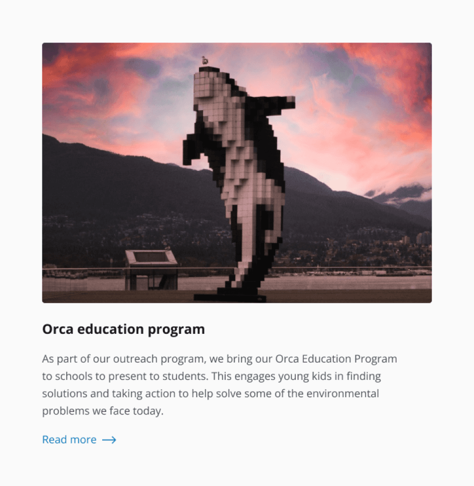
Allow potential donors to explore success stories and project outcomes showcasing the real world impact of donations.
Allow potential donors to explore success stories and project outcomes showcasing the real world impact of donations.
Implement a content strategy that focuses on building trust with potential donors, including testimonials from experts and previous donors that highlight positive outcomes and changes resulting from donations.
Implement a content strategy that focuses on building trust with potential donors, including testimonials from experts and previous donors that highlight positive outcomes and changes resulting from donations.

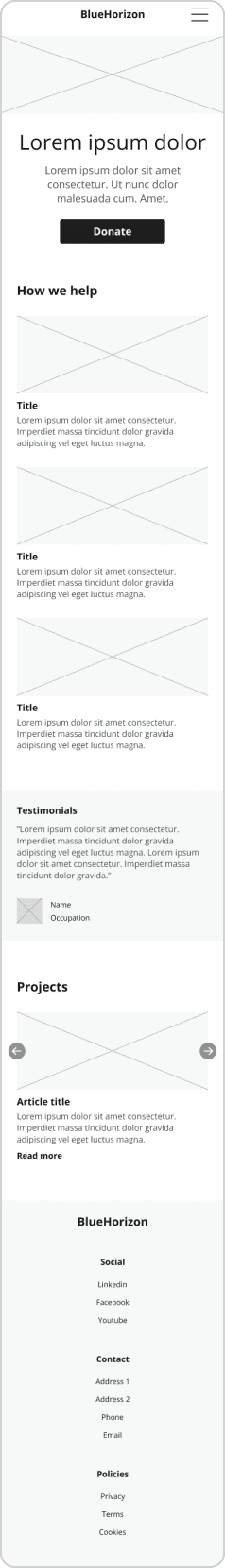
Digital Wireframes
Digital Wireframes
Based on insights from research, I proceeded to design digital wireframes of the home page, as well as donation flow.
Based on insights from research, I proceeded to design digital wireframes of the home page, as well as donation flow.


usability study
usability study
I conducted a round of usability study using digital wireframes, in order to test out donation flow. I did another design iteration based on findings from this usability test.
I conducted a round of usability study using digital wireframes, in order to test out donation flow. I did another design iteration based on findings from this usability test.
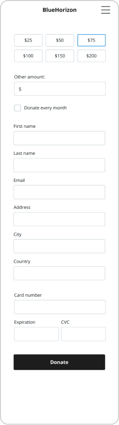
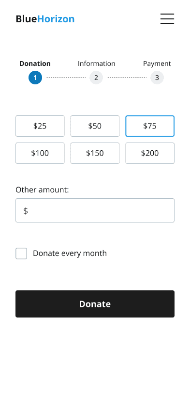
Users would like to have an option to donate a custom amount of money.
Users would like to have an option to donate a custom amount of money.
Most users think that donation form is too long.
Most users think that donation form is too long.
All users were able to find donation button quickly.
All users were able to find donation button quickly.
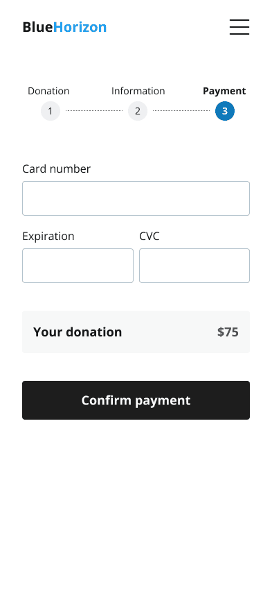
I decided to split donation form into 3 steps to reduce the mental overload for users. Furthermore, I added additional field where users can enter an amount of money they wish to donate, allowing them to have more control over their contributions.
I decided to split donation form into 3 steps to reduce the mental overload for users. Furthermore, I added additional field where users can enter an amount of money they wish to donate, allowing them to have more control over their contributions.


I proceeded to refine designs into high-fidelity mockups, and conducted second round of usability study on them. Findings were the following:
I proceeded to refine designs into high-fidelity mockups, and conducted second round of usability study on them. Findings were the following:
All users understood organization’s mission.
All users understood organization’s mission.
Real life impact of organization’s work was clear to all users.
Real life impact of organization’s work was clear to all users.
Most users were able to navigate to donation allocation page quickly.
Most users were able to navigate to donation allocation page quickly.
THE FINAL DESIGN
THE FINAL DESIGN

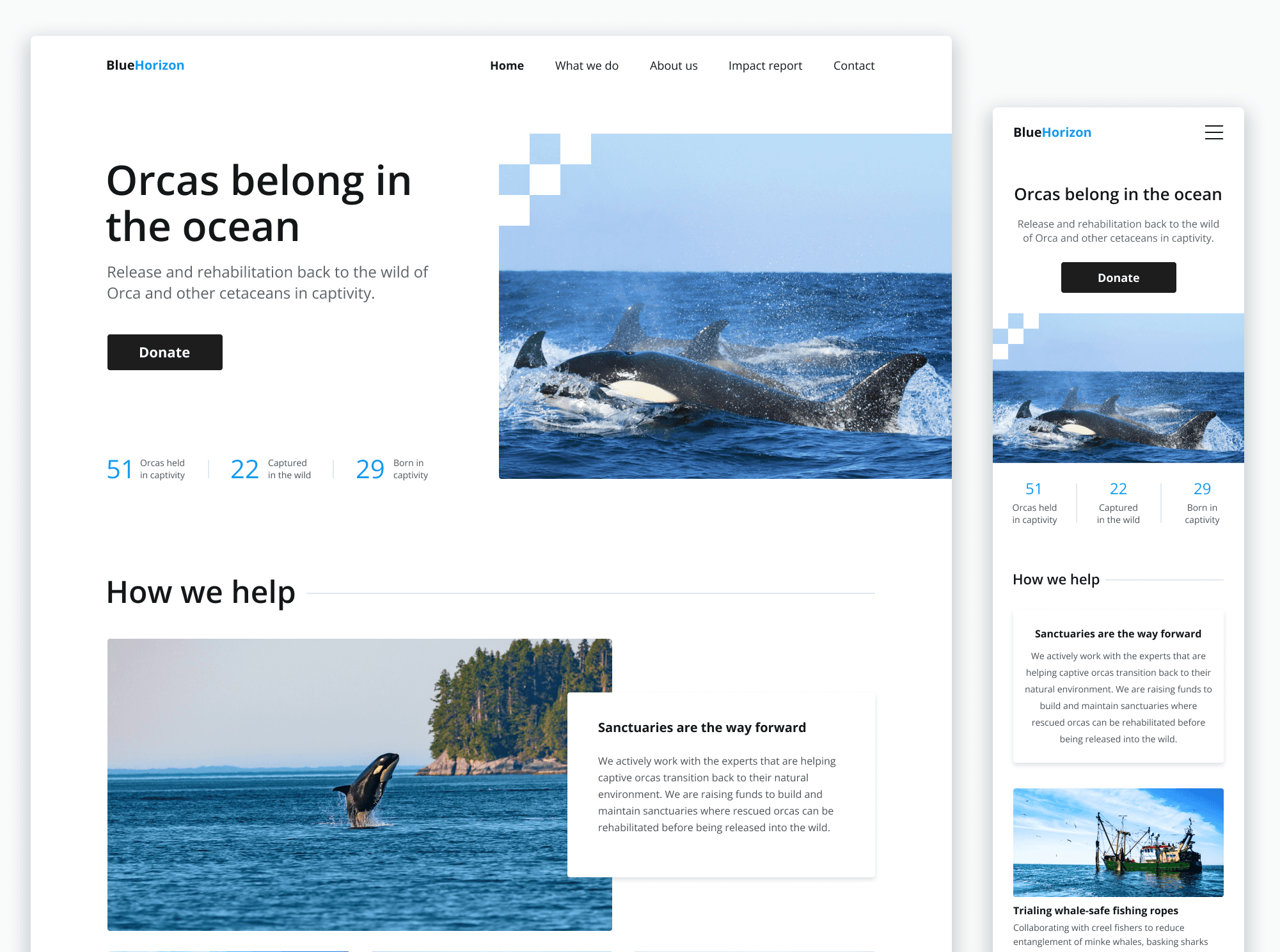
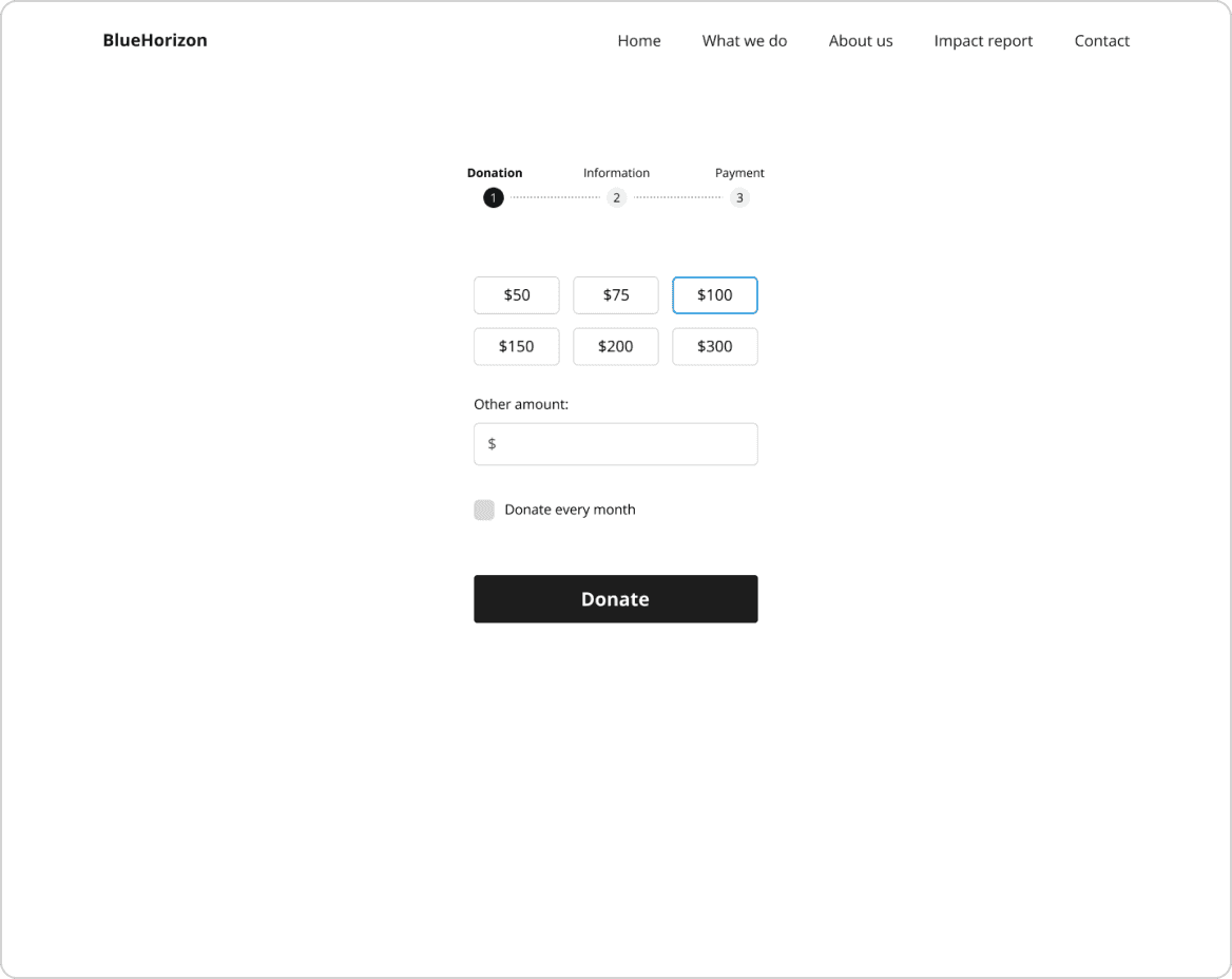
Landing page

Impact report

Donation flow - donation

Donation flow - information

Donation flow - payment

Donation flow - success

Landing page
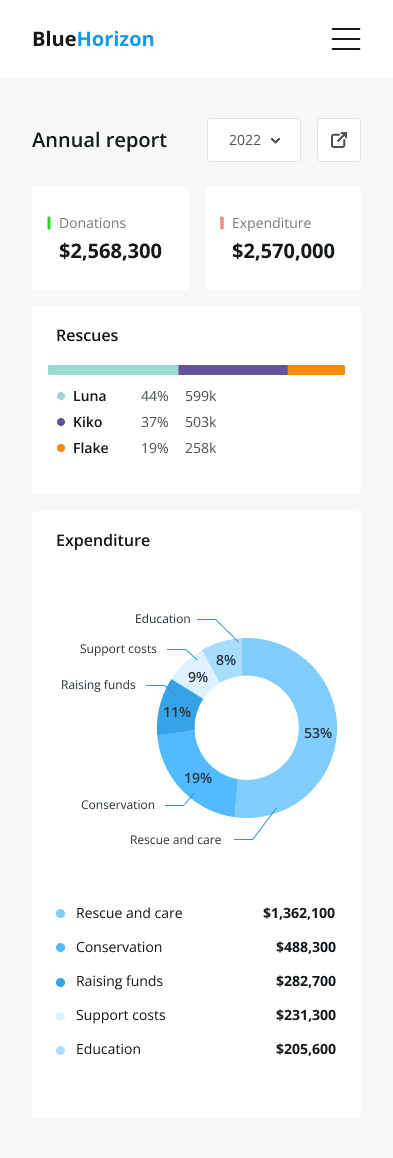
Impact report
Donation flow - donation

Donation flow - information
Donation flow - payment

Donation flow - success
accessibility considerations
accessibility considerations
Ensured that all text elements have enough contrast according to WCAG.
Colors used for charts are distinguishable to people with color vision deficiencies.
Ensured that all text elements have enough contrast according to WCAG.
Colors used for charts are distinguishable to people with color vision deficiencies.
next steps
next steps
To improve the design further I would consider making another version of home page with an added section that points to impact report page and conduct A/B testing to see which version performs better in terms of getting users to view donations allocation.
To improve the design further I would consider making another version of home page with an added section that points to impact report page and conduct A/B testing to see which version performs better in terms of getting users to view donations allocation.
Thank you for reading!
Thank you for reading!
Thank you for reading!